

Auckland needs more colour
Just imagine!

Crust is a weekly newsletter on taste and culture from Tāmaki Makaurau.
Mōrena. It’s cold, by Auckland standards, this morning. Six degrees, my phone tells me. And my window. I’m wearing a long, heavy Roisin Dubh skirt that I bought to take to China this month, without realising it’s far too thick for their steamy 35-39 degree weather. It’s not that here, where we’re having the nicest version of winter imaginable.
It’s been the kind of week when this feels like it could be the most beautiful city in the world, or one of them anyway. People complain less. The winter light is strong and clear, reducing the gravity of the air it moves through. You feel more buoyant, or I do anyway. I did yoga and attended the Michelin awards and ate Gui Rice Noodles in bed: balance. By Sunday morning, I was at a bar filled with Croatians watching the football, before ending up at Ponsonby Pool Hall. For such a cavernous space, it succeeds in feeling cosy — a rare thing in this city, where so many interiors err on the side of spare or “minimal”. It’s painted red, which always helps.
Visitors to Auckland might be quick to assume that only white or grey paint is sold in the domestic market. A sea of grey roofs greets you when arriving from the north. Driving in on the western motorway from the airport, it’s much the same sight as you reach Grey Lynn and Ponsonby, two suburbs that have been drained of colour at much the same pace as property prices rose. All those white houses and white fences look like teeth in a well-tended mouth. Tāmaki Makaurau’s urban form has always been quite beige, but those wild years of taupe, buttercream and even blue (!) feel like a distant memory.
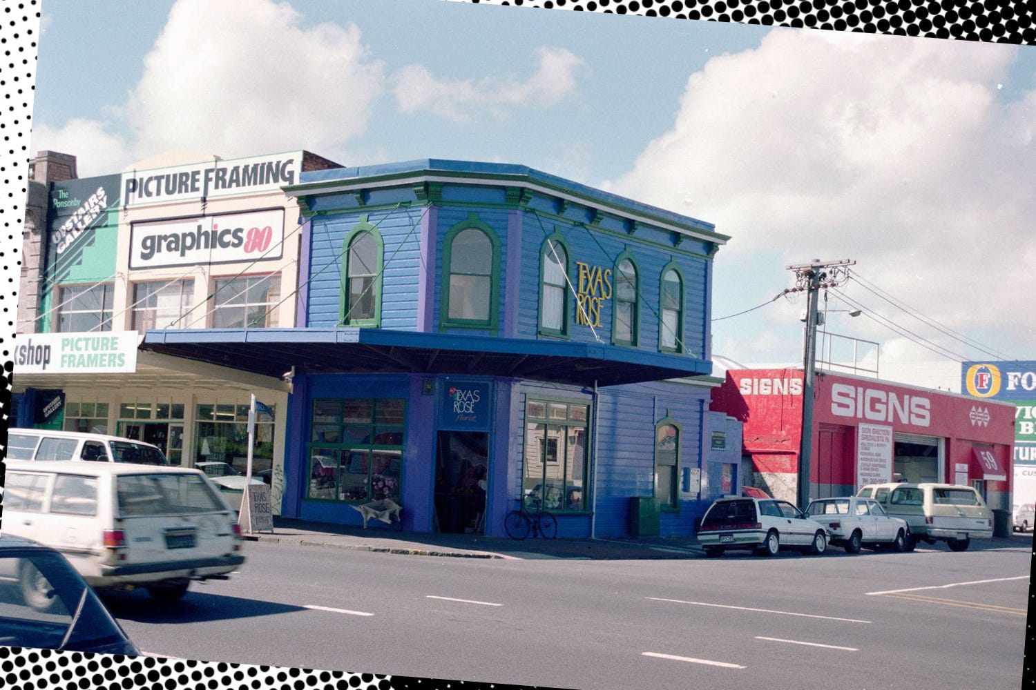
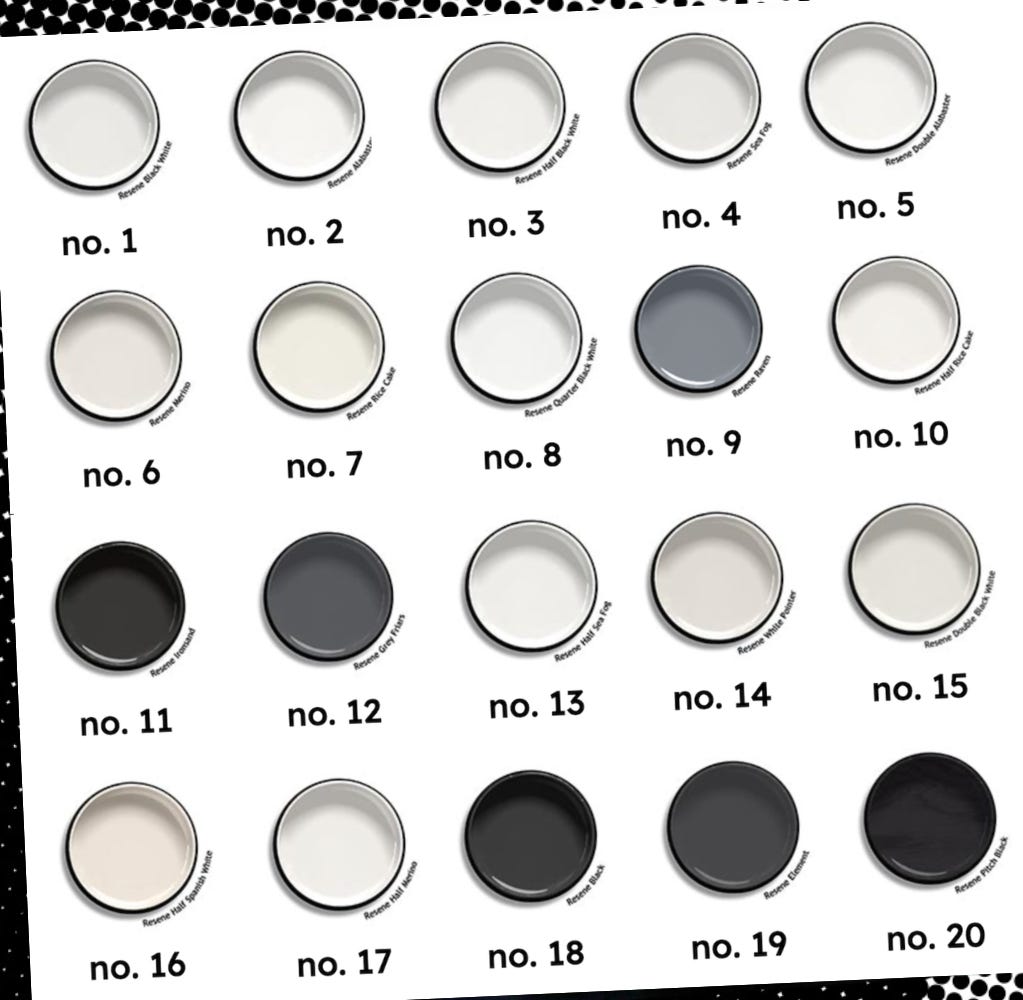
And it’s getting worse. The recent crop of white-on-white-on-white villas have an unreal quality; they’re uncannily similar to 3D printed replicas or unfinished models, except life-sized and requiring a mortgage or generational wealth. Is the city really becoming exsanguinated? I consulted a state-of-the-nation resource: Resene’s top sellers. Its most popular paint last year was “Black White” (which is white). The seven that came after it were all variations of white too. In fact, of the top twenty, there were fourteen whites. The rest was made up of four shades of grey and two blacks, proving the fad for black-box houses has clearly gained traction. But it’s not all dull. Resene’s copywriting is more lyrical than OPI naming conventions; Double Black White is described as “deliberate and dense”, while Quarter Black White has a “nebulous hint of grey hiding in its depths”. Nebulous!)
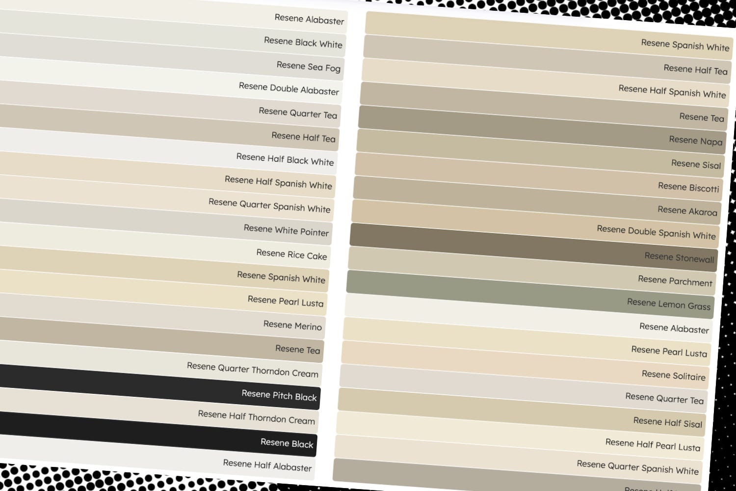
2024’s list is largely the same, save for one random brown. Scroll back to 2006, and things look quite different. Before you get aroused by the idea of a brick red, saffron or teal, let me warn you it contains no wild hues (sorry). But there are colours other than black, white or grey — wow — with Biscotti, Nappa and Lemongrass all making the grade. Taken together, the vibe is warmer, earthier, less stark. Two decades on, however, things have become brutally boring. It’s enough to make you feel “parched with modernity” (a phrase I’ve lifted from Vile Bodies and love).
I blame the cult of property values for depersonalising the city’s homes — a “blank canvas” commands a higher resale value — but we can also side-eye the millennial blanding and what Kyle Chayka dubbed AirSpace a decade ago. Since then, thanks to the aesthetic standardisation wrought by algorithmic everything, even more interiors feel like you’re inside an iPhone or an oat milk box. Outside, on the streets, vehicles are dull too; white, black, grey, and silver account for over three-quarters of car sales in the Asia-Pacific region. Boring!
But it doesn’t have to be this way. Any media hack who’s worked for a local lifestyle title that’s enjoyed a partnership with a paint company (so, pretty much all of us) will be able to tell you there are, in fact, loads of different colours available. You can even use them for your interior walls — a wild proposition, I know — and some people actually do. Kang Nam Station is green, blue and yellow. Rong Sang’s Choice Plaza is red and better for it. Golf Warehouse was yellow long before Chemist Warehouse ventured to our shores.
Karangahape Road bar The Frog is painted a deep green. Stepping inside the narrow space feels like you’ve crawled into a soothing pond (the kind with good beer and friendly faces). Tāné Williams and Robbie Fraser used Bush by Resene to “speak to the lizard brain” and “the calm and comfort of nature”. The effect is dark and cavernous, breaking all the rules of what you should do with a tiny space.
Head along Great North Road and you’ll land at Florets, where the walls are painted halfway up with a glossy dark brown, Resene Woodburn, and the loo upstairs is a sunny, Mediterranean-y yellow, Aalto Paint Reform Citron. Hatch Workshop and Sam Boanas did the interior. It’s cosy and restrained in equal measure. In winter, you feel snug. In summer, I’m reminded of India — a country full of colourful walls.
There I slept in bedrooms painted hospital green and candy pink. I ran my hands over chalky blue walls. Bathrooms had rose tiles and matching basins. Bakeries were azure, red and teal. Walls, doors and frames were painted and then painted again. The doors and balustrade of my favourite guest house in Chennai were green when we first visited, then brown upon returning six months later. All this colour, some of it so random, makes buildings feel alive, and you with them (although heat helps). We should try it.

Reading… Arundhati Roy’s first memoir, Mother Mary Comes to Me. It’s a book about difficult women and dysfunctional families, but refreshingly lacks any therapy speak or pathologising. And India. Her mother ran a radical school in Kottayam and got Laurie Baker to design it. Roy tells us about her unconventional childhood, the hardscrabble years studying architecture and how she then blew her life up more than once. I loved this.
Trying… not to drop my plate of fancy canapés or walk into the back of Ben Bayly while navigating the Michelin event’s “tasting pavilion” on Tuesday night. I was reporting for The Spinoff at the event, which saw a shitload of stars dished out and a lot of happy chefs. You can read all my takeaways here.
Watching… the season finale of From, the show no one watches but everyone should.
Stopping… by the new bFM space. I can’t (and shant!) reveal anything, other than to say it’s brilliant, but will inform you that one can support the station with its big move by signing up for a bCard or donating to the Givealittle.
Revisiting… something I wrote a year ago about skinny jeans, because Wallace Chapman wanted to discuss them on RNZ, post Prada. Their return was inevitable after so many years of big pants. It doesn’t take a divining wand or a salaried trend forecaster to know what happens next. It was inevitable, really, that anyone seeking differentiation or a sense of change would pick up an adversarial silhouette. There’s also a history lesson; I go back to Dior Homme and early 2000s Auckland (with its skinny jeans and sticky teapots) but also to Renton, shivering in his women’s jeans through Trainspotting.

Huffer’s AI controversy has hopped the ditch? Yikes.
The Spinoff has a new podcast? At Large is helmed by Toby Manhire (he’s editor-at-large, you see) and I joined him on Monday to discuss all the Auckland closures. There’s even video!
Carter Were is printing more of her cookbooks? I have three well-used copies and they’re a godsend on weeknights; We have the soups and pastas all the time. It’s a family endeavour — Carter collaborates with her twin Harry and other relatives feature — with the new edition out soon.
Academy is screening Chungking Express this weekend? A movie that’s sure to shake you out of any funk you’re wallowing in, it also has a killer soundtrack. I’ve been playing Faye Wong’s cover of ‘Dreams’ all week just because.
It’s not unusual to pay $50 for a restaurant meal in Auckland now? The inimitable Kim Knight explains why in this enlightening story.
Martin Margiela is auctioning off some of his archive? Shoes! Telephones! Miniature waistcoats! Important news courtesy of Rachel Tashjian.
Apple is hiking prices? So are Microsoft and Dell. It’s all because of data centres, which are driving the soaring prices for memory chips. Tech media is calling it a “RAM-ageddon”.
Pods are coming back? They’ll be on shelves as early as next week.
Illustrator Lily Paris West has designed some merch for New Zealand Fashion Week? Smart idea from the organisers. It’s a little tongue-in-cheek, which is a good way to approach a category that people don’t always take seriously. That “Fashion!” hoodie is great.
New Zealand border seizures for peptides and their ilk have increased 3367% since 2022? More yikes.
Francie is hosting its annual studio sale this weekend? Expect samples, seconds etc and the lovely Anna Woodruff, all of which you’ll find upstairs at 407A Richmond Road. Given the weather, it’s a good time to get some really lovely knitwear at up to 70% off. While you’re out and about, head to Georgia Jay’s yearly sale too, but expect to queue (it’s always worth it though).
Chanel bought Charvet? My friend who sent me this news said “RIP”.
Enjoyed this? Like what I do? Why not become a paid subscriber? If you’re already getting this in your inbox, you can upgrade to paid via the browser version of Substack (Apple takes 30% commission on in-app purchases including subscriptions).
So enjoyed reading this. Still, ngl I'm glad they painted out that blue where Karen Walker is now.
There is a blue house down the road from me which I'm delighted by.